revised December 2, 2022
Announcing the launch of additional graphing and data visualization features on our website.
Culture Biosciences empowers customers to optimize and scale their bioprocesses faster by making bioprocessing R&D a digital experience. Our cloud bioreactors enable scientists to not only design and monitor their bioreactor experiments from anywhere, but to visualize their data and generate insights with ease.
We are thrilled to announce the launch of our new graphing tool, featuring:
Comparing Between Experiments:
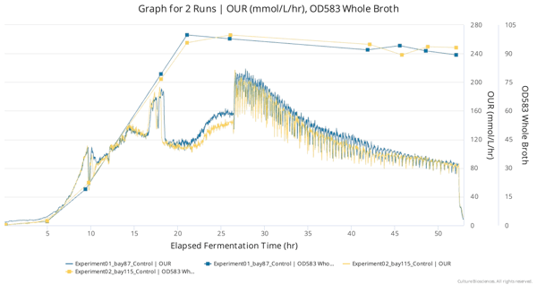
All of the data you generate with Culture is organized into experiments (batches of multiple bioreactors run at one time), and now you can graphically compare data between different experiments with a click. You can monitor your ongoing process in real-time compared against a control process you’ve run in the past, or identify trends by viewing the performance of different run conditions or strains over time.
Custom Overlays of Process Data:
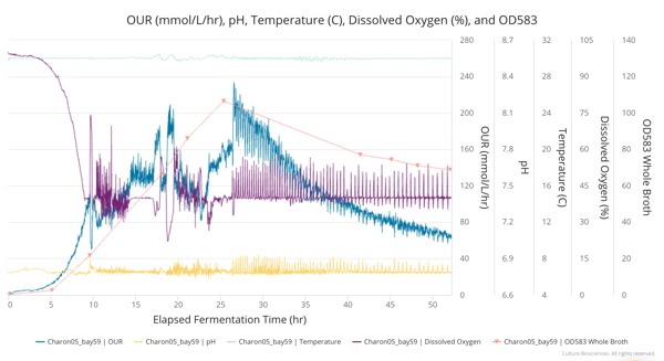
When visualizing data to better understand your bioprocess, you can choose any process parameters to view overlayed with each other. More clearly view interactions between process parameters like agitation, aeration, and dissolved oxygen (DO), or see how different pH or temperature conditions affect the accumulation of a product or metabolite.
Group Runs by Condition:
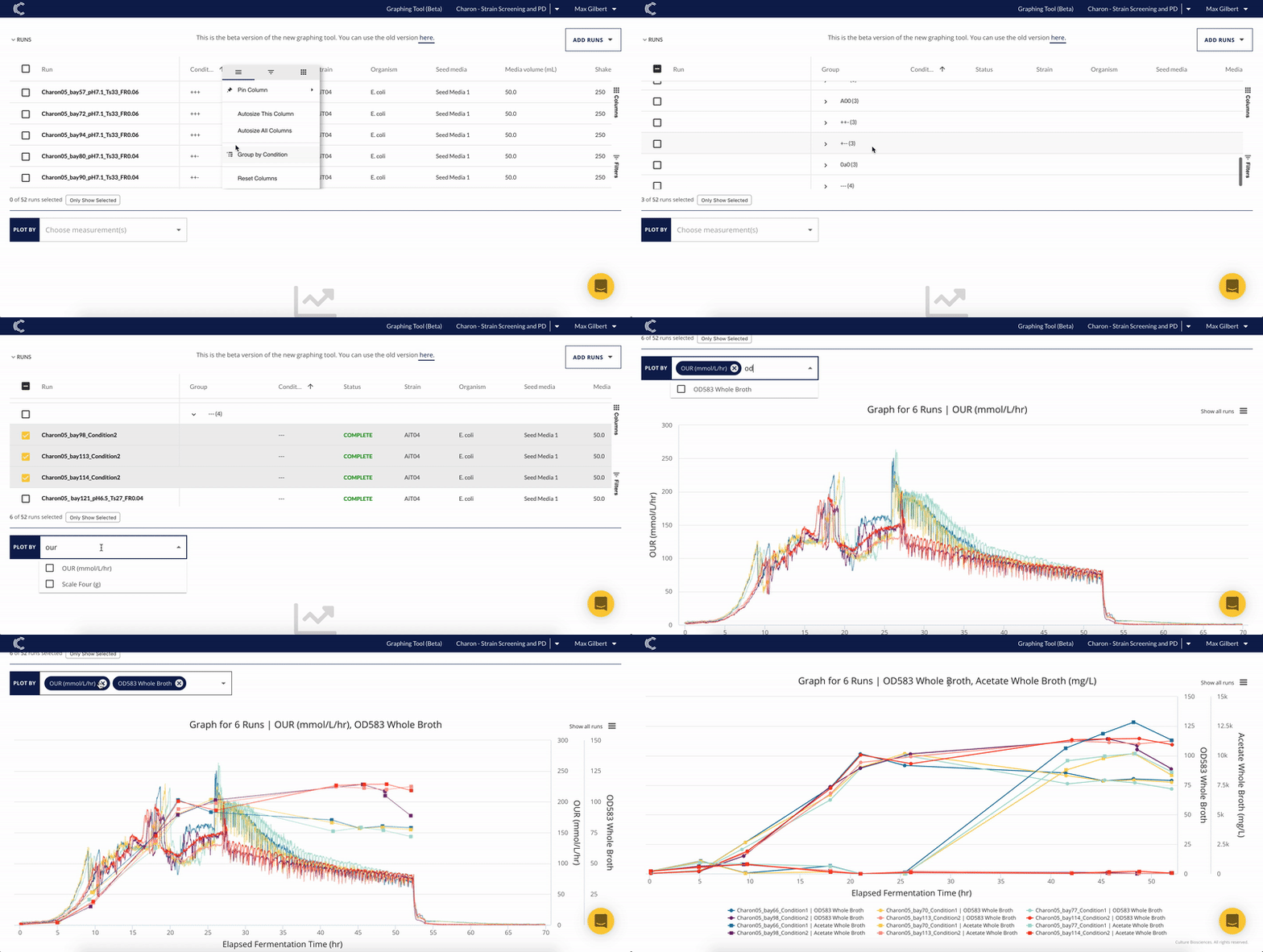
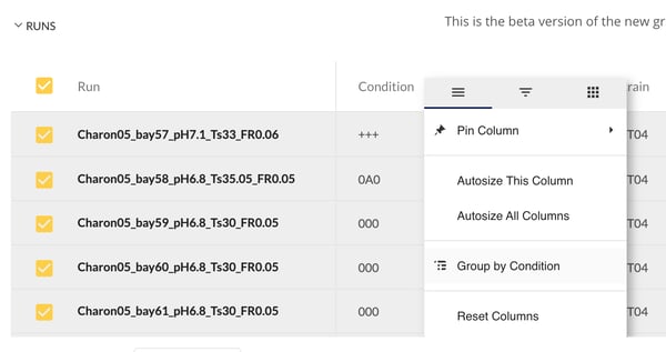
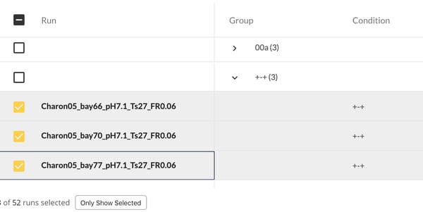
Now you can sort, filter, and graph your data based on experimental run conditions like strain, seed or batch media, or inoculation OD. Parallel table and graph views enable you to more easily toggle runs or groups of runs to create custom graphs and quickly correlate run conditions with results.
Working with Culture, you no longer need to collect disparate Excel files to compare data from different experiments. Do all of your graphing and analysis live on our cloud platform, saving you time and helping you confidently make better decisions faster. Check out the example use case below, and fill out the form at the bottom of the page for a demo of our cloud console.
Example Use Case:
After completing an experiment and identifying the best-performing run, you dig in deeper by overlaying multiple conditions onto a graph:
To verify that the performance observed in this particular bioreactor run is due to the unique conditions tested, you then compare the control process run from this experiment to a control process run from a previous experiment.
Confident that the improved performance is due to the run conditions tested, you want to learn more by comparing this condition to another condition that performed less well. First, you use the table view to group your runs by condition, and then graph the two conditions against each other.
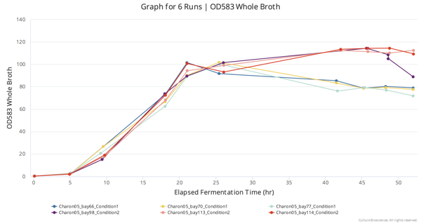
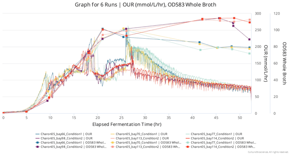
Next, you want to validate that the difference in growth between the two conditions was in fact a result of different metabolism. You layer OUR on top of the OD graph for these two conditions.
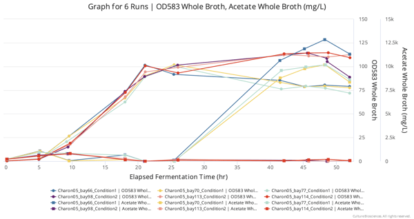
Finally, looking for insight into why the higher-OD condition grew better, you layer on additional metrics. When overlaying acetate sample data, it is clear that the higher OD condition had almost no acetate accumulation, whereas the lower OD condition accumulated substantial acetate later into the run.


.png?width=500&height=500&name=6939d31802fbcbdebdf5b1b0_TCulture%20Biosciences%20%26%20XcellBio%20Announce%20Partnership%20(1).png)
.png?width=500&height=500&name=67e835ae888006cd086a6a7a_Stratyx%E2%84%A2%20250%20Bioreactor%20Platform%20Overview%20(2).png)